
The beginning of 2024 confirmed the trend observed in 2023, the performance of the US stock market is getting narrower by the day, indeed, after the past month we could redefine the S&P 500 and the “Magnificent 7” as the S&P5 and “Magnificent 5”. We explain our reasons below.
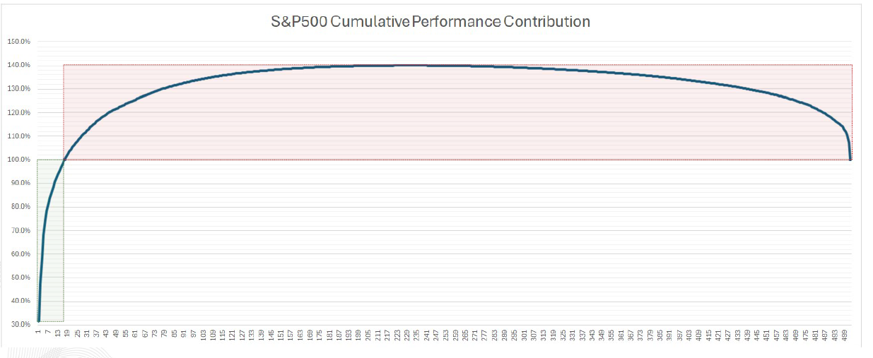
First, we show Chart 1 concerning the Cumulative Performance Contribution of the S&P500, from the best contributing stock to the worst contributing one, since the beginning of the year. From the picture you can see that only 17 stocks have generated about 100% of the index's performance, while the other 483 stocks delivered no growth, cancelling each other out. This means that, as of today and as in 2023, having a diversified portfolio is not/was not an optimal choice. On the other hand, having a concentrated portfolio, especially in certain securities, is/was highly successful.
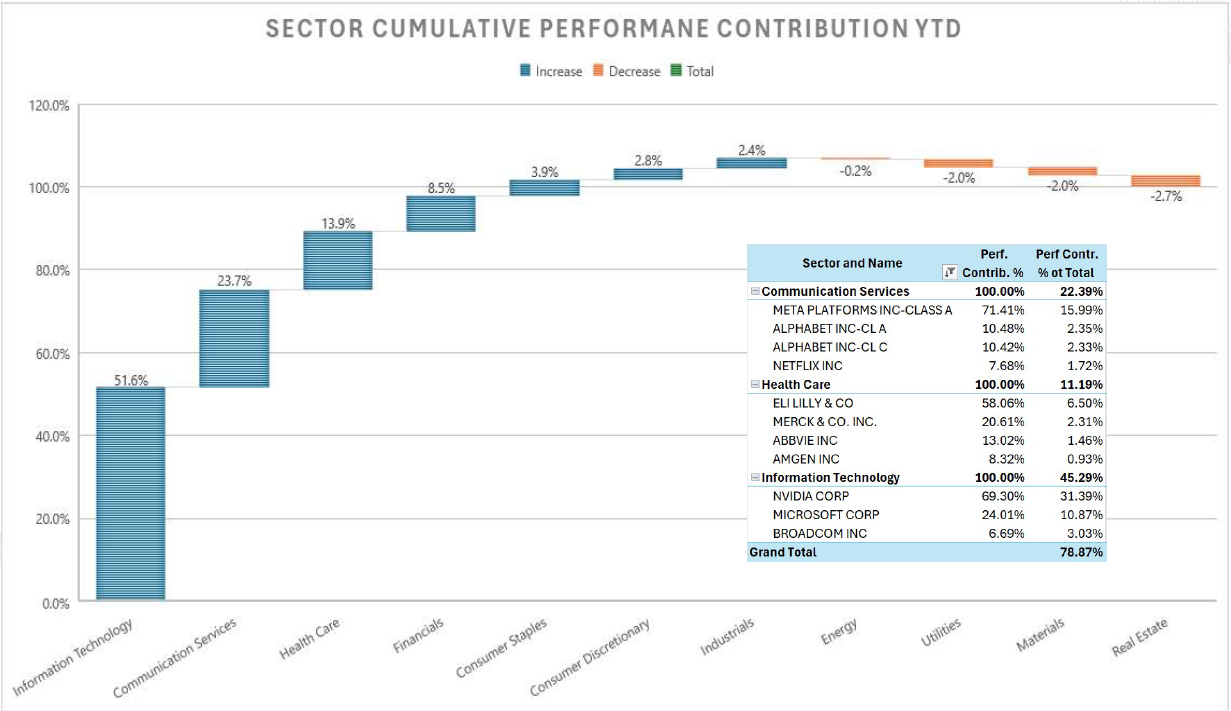
The same concept can be observed from a sector perspective. Chart 2 shows that 74% of the YTD return of the S&P500 was realised by two sectors: Information Technology and Communication Services. Adding the third one, Health Care, the performance reaches 88% of the total. Going into detail, the table above the graph highlights the best stocks within the three segments. Here again, the figures underline the narrowness of the market. In each of the industries, one stock stands out as contributing more than 50% of the total performance: Nvidia for 70% in Information Technology, Meta for 71% in Communication Services and Eli Lilly for 58% in Health Care.
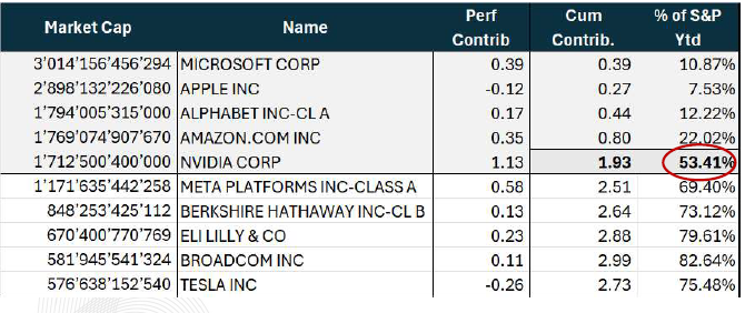
Even the 'Magnificent 7', the great winners of 2023, lost participants due to the tight market. At the start of 2024, two global market giants such as Apple and Tesla fell off the bandwagon. Table 1 illustrates the negative contribution performance of the two companies since the beginning of the year. The remaining five companies, on the other hand, contributed more than half of the YTD performance of the S&P500.
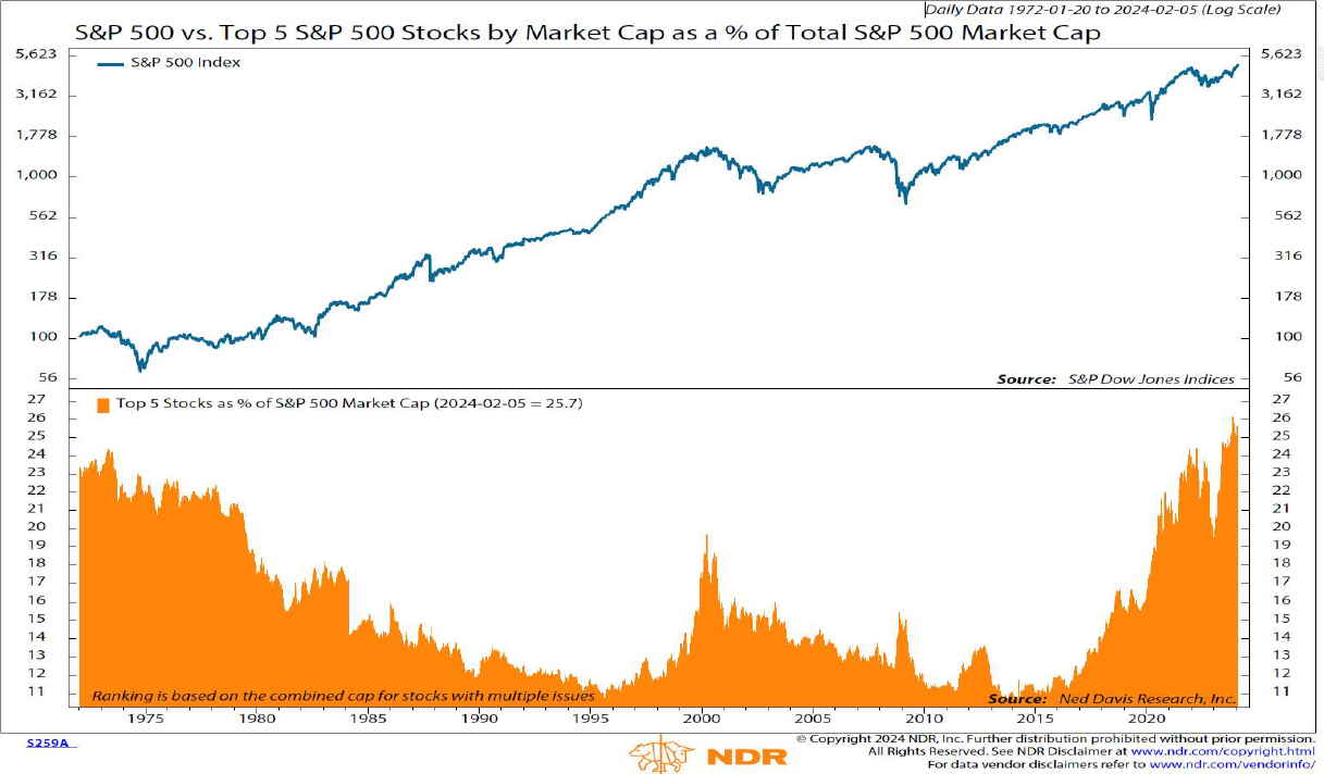
The remarkable market tightness we are witnessing today is a phenomenon that has occurred before. Chart 3 below in the upper part shows the performance of the S&P index since 1971, while the lower part illustrates the % weight of the top five stocks over the same period. We have reached an unprecedented level, which, in part, is justified by the extraordinary nature of these companies. As mentioned in other publications, compared to competitors (if any) these firms grow more and have higher free cash flows, and thus, higher returns on capital, and deserve premium valuations.
It is important to note that this condition does not seem to be sustainable in the long run, indeed, the graph shows that after a period in which the top 5 stocks heavily outperformed the others, the following years are characterised by significantly broadened index’s performance, the contribution to result is much more homogeneous. Moreover, it appears that after these peaks generated by a few stocks, the subsequent decline is significantly autocorrelated, i.e. investors dump the top 5 stocks from their portfolios to buy shares of the other smaller companies.
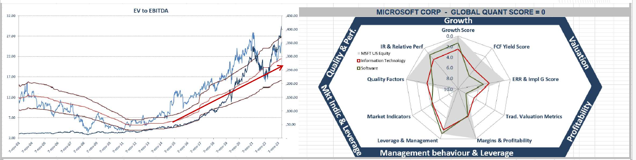
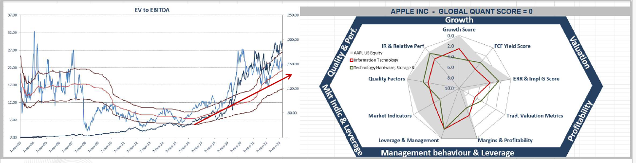
Now let us focus on two of the world's leading companies: Apple and Alphabet (Google). Through the following two graphs, we want to highlight how one variable, the expansion of multiples, may or may not have favoured the development of a narrow market. The charts are made up of two analyses, on the left we illustrate the development of the EV/EBITDA index from 2003 to the present, while on the right we find a spider graph produced by our internal quantitative model. Our model assigns the company a 'Global Quant Score' from 0 to 10 (0 = best score, 10 = worst score), based on its economic-financial data and future prospectives. We anticipate that both companies score 0; the main difference is related to the EV/EBITDA ratio. Starting with Apple, it is evident that the company has been re-rated by investors over the last four years. Before 2019, the average value of the multiple was 12, in recent years the average has substantially risen to around 22. This phenomenon has certainly contributed to the market structure we observe today. For Alphabet, on the contrary, the expansion of the EV/EBITDA multiple has not taken place; the trend seems to be the opposite with the average value dropping from around 20 to around 15. Nevertheless, Google remained one of the world's leading companies by capitalisation.
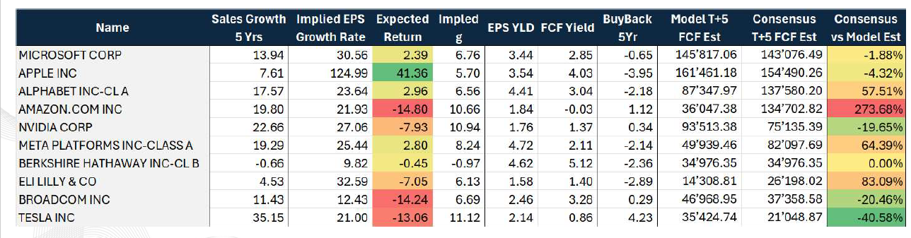
Lastly, to conclude this section, we have decided to provide you Table 2 which depicts the top 10 companies in the S&P500 index by capitalisation. We show you two interesting insights. The first concerns the "Expected Return" column, which shows the % difference from the fair value calculated by our internal model. Almost all companies are close to their fair value, only Apple seems to be significantly at a discount to its potential. Amazon, Broadcom and Tesla, on the other hand, are the most overvalued. The second refers to the last column, "Consensus vs Model Est" shows the % difference between our model's estimate of FCFs over the next 5 years compared to the consensus. Here, the gap on Amazon is striking, the consensus vs. our calculations heavily overestimating the company's cash generation. The opposite situation occurs on Tesla, where our model estimates a T+5 FCF 40% higher.
Employment outlook and implications for a soft landing
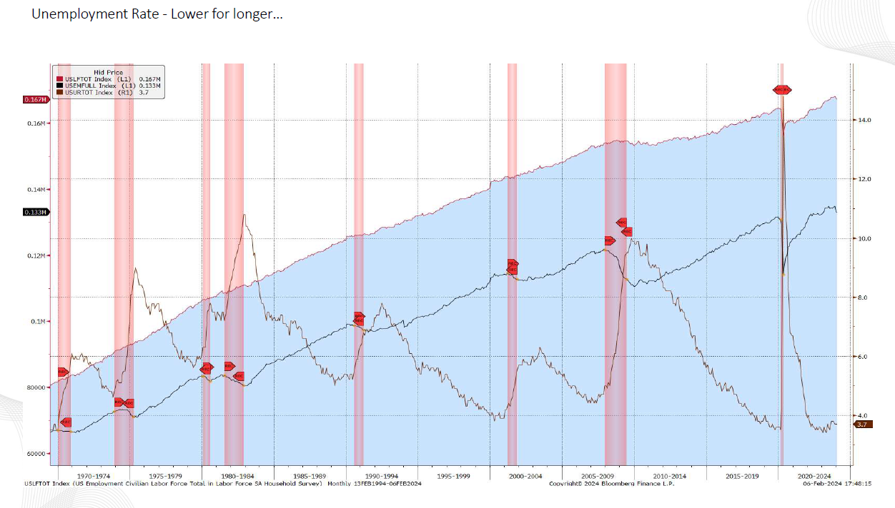
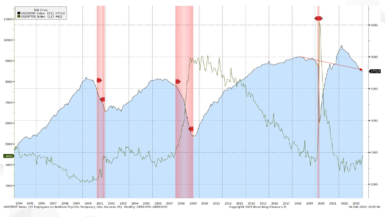
As the Fed preaches “higher for longer” for rates, if the economy is really that strong then the unemployment rate will be “lower for longer”. Looking at Chart 6, we can see that the brown line in the bottom right-hand corner, which represents the unemployment rate in the US, has subtly increased since the start of the interest rate hike. The cause is the reduction in the number of new hires over the last period. Arguably, the rise in the unemployment rate would have been greater, but an acceleration in labour participation slowed the rise. Indeed, more people entered the labour force and as a result unemployment rose, but only slightly. To confirm this, the black line shows total employment, which has fallen marginally in recent months.
Although from Graph 6 just analysed, it appears that the US labour market remains robust, the data illustrated in Graph 7 bucks the trend. The black line represents the number of part-time employees, while the green line indicates the number of part-time employees taking jobs due to economic necessity. The black line shows that there is a slowdown and at the same time the green line suggests that more people are taking part-time jobs because they cannot find a full-time job. In this second case, there could be two reasons:
- Mismatch between demand and supply of labour, i.e. job seekers do not have the requirements or qualifications to be hired.
- Slowing in the labour market (at the margin), this effect does not currently spill over into the unemployment rate, but it could be visible soon.
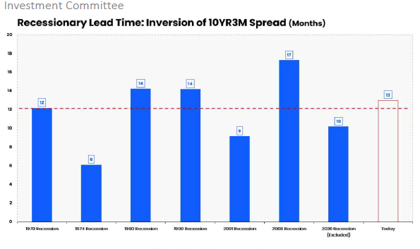
Now we introduce another element into this discussion which may impact the US labour market in the future: the inversion of the 10Yr3M curve. In recent months several analysts have started to argue that the inversion has lost any predictive power related to the business cycle. We believe that this is not true, or rather that it is too early to tell. In fact, Chart 8 below shows the number of months that elapsed between the inversion of the 10Yr3M curve and the onset of past recessions. The average is about 12 months, so far 13 months have passed since the inversion. In any case, there is nothing to prevent another three or four months before a new recession begins, as happened in 2008 (17 months).
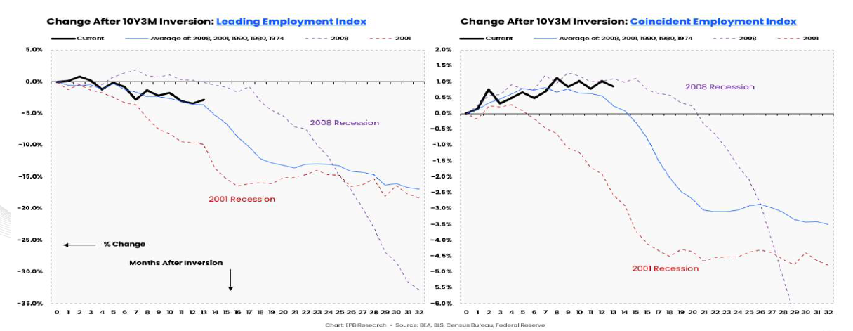
Another reason why we support this thesis is described by the next two graphs (Graph 9 - 10). Combining the number of months since the inversion of the curve with the Leading Employment Index before and the Coincident Employment Index after, the results are similar. In both graphs, we can see that the current trend of the two indices over the past 13 months is similar to the average of the two indices before the beginning of the past recessions. For this reason, it is premature to say that a recession will not occur, in favour of soft-landing.
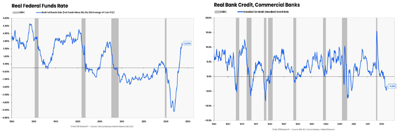
To conclude, we propose a brief reflection on the level of real interest rates and the banks' ability to provide credit. Both factors have had and continue to have a significant impact on the economy. As illustrated by Chart 11 real rates are above 3%, these conditions do not provide an incentive for consumers and businesses to apply for new loans, which consequently hinders new investments and thus economic development. At the same time, the inverse interest rate curve limits the banks' business as they collect short-term resources from depositors and reinvest them long-term in the form of loans. Currently, it is more expensive for banks to remunerate funding than they would get from lending. Chart 12 underlines this effect. Let us remember that this affects primarily small/medium-sized banks, which finance the majority of American small/medium-sized enterprises, which in turn account for the largest share of US employment. It is no coincidence that the Russell 2000 (US Small Cap index) has been suffering particularly badly since the beginning of the year, especially since most of its constituent companies are financed at floating rates. Moreover, last week the New York Community Bank after announcing unexpected losses (in 2023 it bought part of Signature Bank's assets) was downgraded to junk by Moody's and lost half its value on the stock exchange, recalling the problems of US regional banks.
About the author
LFG+ZEST SA