
SOFT DATA VS HARD DATA
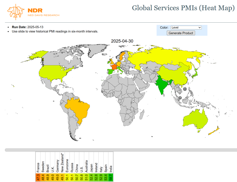
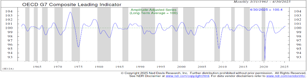
The economic data we observe on a daily basis can generally be divided into two distinct categories: hard data and soft data. Hard data are quantitative in nature, objective, measurable figures collected from official sources, such as GDP. Soft data, on the other hand, are qualitative: they reflect opinions gathered through surveys and interviews. A prime example is the PMI (Purchasing Managers' Index), which is derived from monthly surveys of purchasing managers across various industries. Unlike hard data, soft data incorporate not only current business activity but also future expectations, making them more sensitive to changes in sentiment. This difference has led to notable divergences between soft and hard data, especially following the U.S. elections and the ongoing trade war. Such a divergence is clearly illustrated in Chart 1, which shows Global Services PMIs (soft data), and Chart 2, the G7 Composite Leading Indicator (hard data). Chart 1 suggests we are not experiencing an economic boom, but rather a phase of slowdown, driven in part by high interest rates, geopolitical uncertainty, and the consequences of the trade war.
In Chart 2, by contrast, the G7 Leading Indicators point to a more solid and improving economic outlook, remaining above the 100 point threshold. These financial components, which implicitly reflect forward looking expectations, suggest a more optimistic scenario than the one conveyed by the sentiment captured in purchasing managers’ surveys.
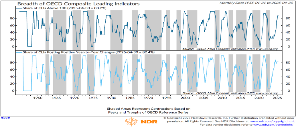
Expanding the sample to a global scale, the picture remains similar. Nearly 90% of countries report Leading Indicators above the 100-point mark, signaling a potential global recovery in contrast to the slowdown suggested by soft data.
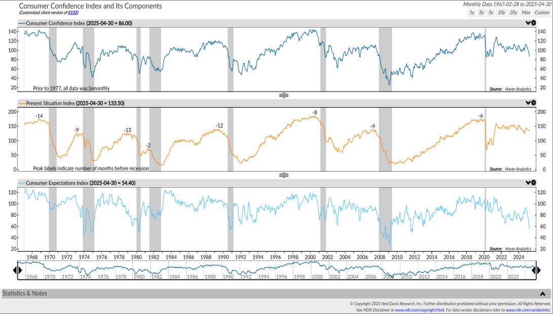
Focusing on the United States, another soft data indicator that highlights the current impact of the trade war and government spending cuts is Consumer Confidence. As shown in Chart 4 (top), consumer sentiment has deteriorated significantly in recent months. This decline is driven primarily by expectations for the future (bottom chart), rather than by perceptions of the current situation (middle chart).
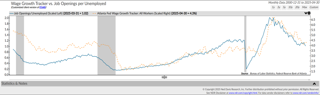
Nevertheless, when analyzing the U.S. labor market, this widespread pessimism may appear somewhat exaggerated. Chart 5 (blue line) shows the ratio between job openings and unemployed workers (hard data). While this ratio has declined noticeably since its 2022 peak, it remains at historically elevated levels compared to previous economic cycles.
In addition, the orange line, which tracks wage growth, is gradually returning toward the 2.5%–3.5% range, a level considered non-inflationary by the Federal Reserve. These factors further contrast with the current consumer sentiment regarding future economic conditions.
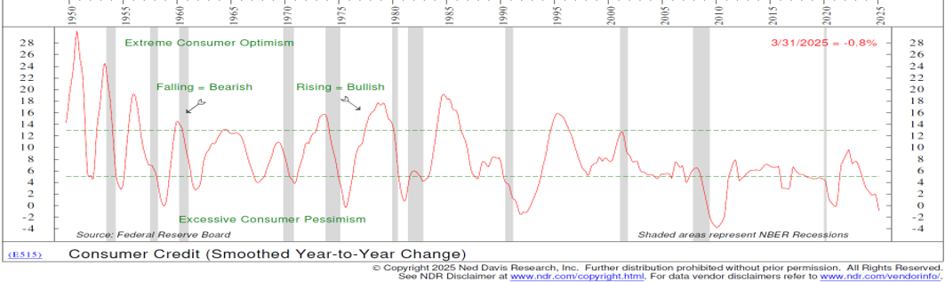
Another indicator that could point to a different and improving outlook, compared to what is suggested by Consumer Confidence, is the consumer credit cycle. Chart 6 clearly illustrates how, over the past two quarters, the total amount of credit extended to consumers for non-mortgage-related purchases, such as durable goods and personal expenses, has declined significantly. However, the current level appears to have reached a historical threshold typically seen in post-recession periods, potentially setting the stage for a rebound.
In this context, it becomes especially relevant to monitor the second derivative of the indicator, as it can signal a change in trend, in other words, the beginning of an acceleration in consumer spending. Such a scenario would be highly positive for spending appetite and, consequently, for economic growth.
MARKET VALUATIONS
Let us now assess the current market valuation and what it may imply in terms of recession probabilities for this year and for 2026.
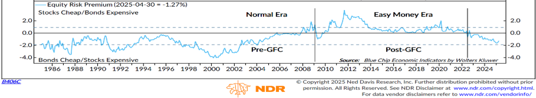
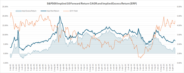
As shown in Chart 7, the Equity Risk Premium (ERP), calculated by Ned Davis Research as the difference between the Earnings Yield and the Corporate Bond Yield, initially appears to suggest that, based on the past decade, the market is extremely expensive. However, considering that interest rates were near zero throughout the post-GFC (Global Financial Crisis) period, this analysis may be somewhat distorted. By extending the time horizon and comparing today’s ERP with levels observed prior to the GFC, we obtain a more realistic benchmark. While current valuation multiples are relatively high, we can reasonably conclude that markets are not displaying signs of euphoria or irrational exuberance.
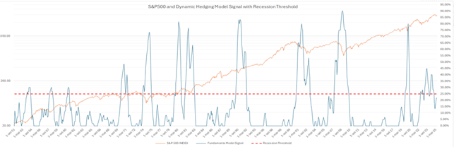
Our Dynamic Hedging model, shown in Chart 8, also reflects a “normal” fundamental environment. The blue line remains below the red dashed line, which represents the threshold between a potential recession and a stable scenario.
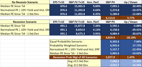
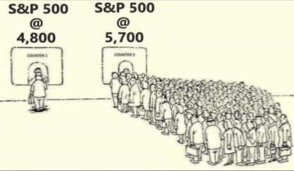
Similarly, our Fair Value model for the S&P 500 indicates a valuation that is broadly in line with current market levels. As of last Tuesday's close, the model's target for the index, assuming no recession, stands at 6,111 points, implying an upside of approximately +3.77%. In recent weeks, the market’s upward move has been mainly driven by a decline in the Equity Risk Premium (ERP). Specifically, the implicit ERP has narrowed due to a rise in long-term interest rates, while earnings estimates for both this year and 2026 have remained largely unchanged. Despite the strong rebound, investor sentiment appears to have turned much more bullish compared to early April, as humorously illustrated by this cartoon highlighting the irrational behavior often seen in financial markets.
About the author
LFG+ZEST SA