
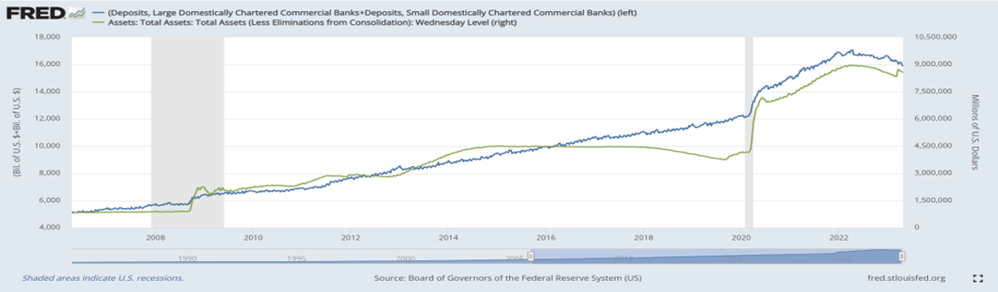
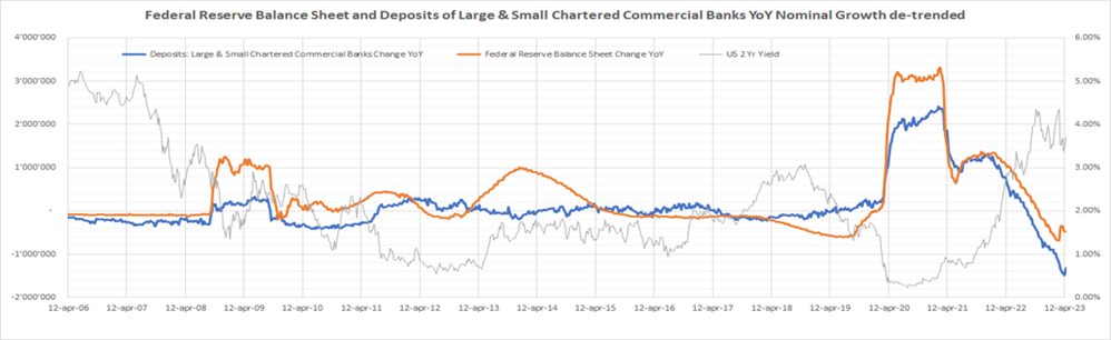
The FED's balance sheet after the outbreak of the COVID-19 grew significantly, as the central bank injected large amounts of liquidity into the market and the government offered important fiscal aid to citizens and businesses to support the economy. This injection of liquidity flowed into the bank deposits of businesses and households held in small and large banks, as the trends of the two variables in the two graphs below exemplifies; The first shows the size of the two variables (Federal Reserve balance sheet and bank deposits in financial institutions) while the second represents the year-on-year change of the two.
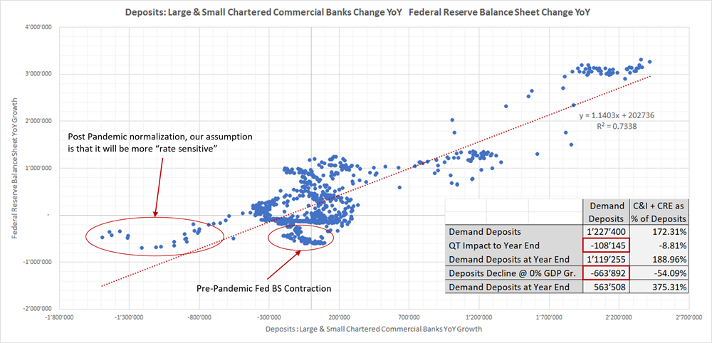
The relationship between the Fed's balance sheet trend and banking accounts growth intensified in the post-pandemic period, the following graph shows the regression between the two variables (with a high correlation level of 73.4%).
In the graph above, the oval on the left indicates the impact on bank deposits from the liquidity withdrawal during the Federal Reserve Quantitative Tightening (QT) manoeuvre in the post-Covid period: this impact is more pronounced than in the pre-Covid period (oval on the right). The main reason, in our view, is the different level of interest rates. In the left oval, interest rates are higher, so banking accounts are more sensitive to a change in the Fed's balance sheet. During QE (Quantitative Easing) the Central Bank creates (indirectly) deposits in the banking system and vice versa during QT periods, so a phase of liquidity drainage by the Central Bank has a greater impact on bank deposits when interest rates are above the level of inflation expectations (around 2.0%). The higher interest rates are, the more bank deposits will be affected compared to other periods of QT. Through cost-opportunity analysis, households and corporations prefer to invest in money market instruments rather than leave their cash holding sit idle with no remuneration. J. Powell has repeatedly stated that rates will remain close to current levels until inflation will revert to the 2.0% target so, in our view, it is reasonable to assume that the strong relationship between the two variables will remain.
In the chart on the bottom right there is a table explaining what would happen to bank deposits at the end of the year if the Central Bank continued on their target $95Bil of QT per month. The discriminating factor is economic growth: if GDP rises, the drain on deposits due to QT is mitigated by the increase of deposits due to economic growth, vice versa their decrease is not compensated by GDP growth.
- In a positive economic growth scenario, we would have a reduction in deposits of about $110Bil.
- In a scenario where the economy slows down and growth is 0%, the decrease in deposits would be around $660Bil. (54% of total deposits).
These two scenarios are to be considered as extreme cases; the analysis suggests that by the end of the year, the range of deposit reductions could be between 8% and 54% of total deposits in the US Regional Banks, which have recently been the focus of attention in the financial markets. This is important because the level of liquidity available at Regional Banks is low compared to what is normally maintained for the normal running of banking business (levels similar to those seen during the REPO crisis of 2018) and if the Fed continues its QT some banks may find themselves in trouble again, lacking liquidity to cope with the reduction in deposits.
The next slide shows three analyses highlighting the possible loss on the Equity of Regional Banks in the case of losses on the investment portfolio, on Commercial Real Estate loans or in the loan portfolio granted to small and medium-sized enterprises:
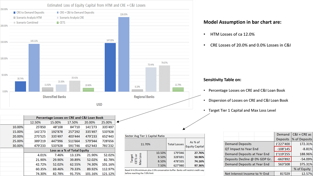
The first analysis refers to the chart above. Assuming 12% of losses on the Investment Portfolio (due to the rise in interest rates over the past 12 months) and 20% of losses on Commercial RE (again due to the rise in interest rates), the average loss on Regional Banks' Equity could be close to 80%; this would necessitate massive capital increases or further bailouts such as those we saw in early spring.
The second analysis is depicted by the table on the bottom left. At the top we find the % value describing the potential loss on Commercial Real Estate and loans to SMIs, while on the left we find various assumptions on loss dispersion in the banks' lending book. The result is shown in the second table 'Loss as a % of Total Equity', the loss could vary between 30% and 100%.
Finally, the last analysis (table in the middle) shows the target Core Equity Tier1 level that a bank should have before it must reduce its investment book or forced to make a capital increase to restore capital ratios. Currently, the average CET1 of Regional Banks is 11.70%, if it drops, also in this case the loss on equity would be between -30% and -100%.
However, the situation is not as bad as it was in 2008, because although the bankruptcies of Signature Bank ($110Bil) and Silicon Valley Bank ($209B) are dimensionally important, the capitalisation of the entire ecosystem of major Regional Banks is only $400Bil. The problem is there, but it is not systemic, its ramifications are to be sought in the possible decrease in access to credit for small and medium businesses, which even in the USA constitute the main backbone of the economy.
Economic Indicators and Labor Force Dynamic
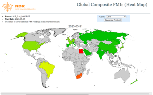
The Leading Indicators (of the Business Cycle) signal that there will be an economic slowdown and possibly even a recession in the coming quarters; the positive aspect is that for most of the world’s economies the leading indicators have stopped deteriorating and give some first indications of stabilisation. On the contrary, the Coincident Indicators (PMI), as shown in the image below, indicate that the economic expansion is still strong; recession is probably on the way, but it should be modest, due to the strength of the labour market (later on).
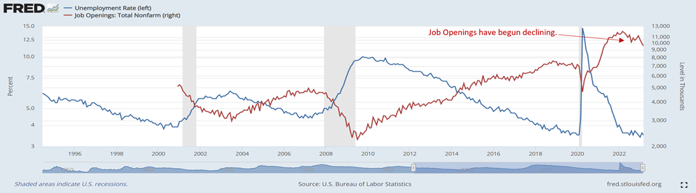
Looking at the labour market, an important anticipatory indicator is “Job Openings”. After peaking at around 11.5 million, job vacancies/offers fell to around 9 million, marking a significant slowdown; this factor, in our view is confirmation that there are the first modest signs of a slowdown.
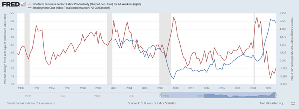
Going into detail, labour market conditions are currently set in an unfavourable scenario for companies, indeed, in the graph below, the red line indicates productivity levels, while the blue line indicates wage growth. The first variable is at minimum levels, while the second is at maximum levels. There is an increase in labour costs that is not offset by an increase in productivity; this will negatively affect corporate profitability in the coming quarters by putting pressure on margins as economic growth slows. Labour intensive sectors will be most affected, of course.
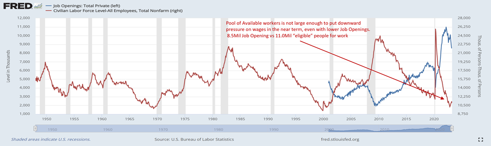
Despite the reduction of 'Job Openings', the labour market is still so 'tight' that the diminution does not have a negative impact on wage growth, which remains high. In addition, the unemployment rate remains stable because there are not enough people available for work compared to the open positions. The graph below highlights this concept. This justifies the current wage growth above historical averages, which is likely to remain at these levels in the coming months. The work of the Central Banks may be more difficult than expected in the absence of an economic recession.
Sobre el autor
LFG Investment Consulting SA